Bitcoin Liquidation Heatmap: What It Is and How Smart Traders Actually Use It
If you have spent any time on crypto Twitter, in a trading Discord, or scrolling through YouTube videos about Bitcoin price action, you have probably run into a chart covered in glowing yellow and orange bands sitting on top of a candlestick chart. That chart is called a bitcoin liquidation heatmap, and over the last couple of years it has gone from a niche tool used mostly by derivatives traders to something almost every serious Bitcoin trader checks before making a move.
But what is it actually showing you? Why do prices seem to “snap” toward those bright zones? And can you really use it to predict where Bitcoin is headed next? In this guide, we will break down exactly what a bitcoin liquidation heatmap is, how it is built, how to read one without getting confused, and how to fold it into a broader trading strategy without falling into the trap of treating it like a crystal ball.
What Is a Bitcoin Liquidation Heatmap?
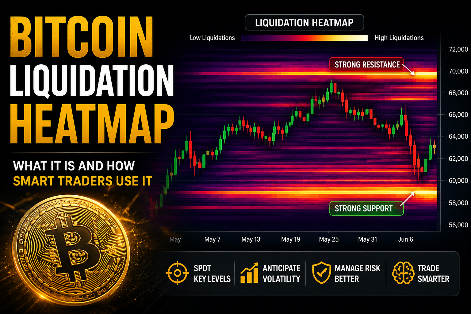
A bitcoin liquidation heatmap is a visual tool that estimates where a large number of leveraged Bitcoin positions would get forcibly closed if the price moved to a certain level. Think of it as a map of “landmines” sitting above and below the current price, except these landmines are made of leverage instead of explosives.
Here is the basic mechanics behind it. When a trader opens a leveraged position on a futures or perpetual swap exchange, they are essentially borrowing money to make their bet bigger. In exchange for that extra buying power, the exchange sets a liquidation price. If the market moves against the trader far enough that their margin can no longer cover the potential loss, the exchange automatically closes the position. That forced closing is called a liquidation.
Now imagine thousands of traders opening similar positions with similar amounts of leverage around the same price levels. Each of those positions has its own liquidation price. When you stack all of those individual liquidation prices on top of each other and plot them as a color gradient on a price chart, you get a heatmap. Brighter colors, usually yellow, orange, or white depending on the platform, represent price zones where a large dollar value of leveraged positions would be liquidated. Darker colors represent areas with very little leveraged exposure sitting nearby.
The result is a chart that looks a bit like a weather radar, except instead of showing rainfall, it is showing where forced buying or forced selling could erupt if price reaches that zone.
Why Liquidation Zones Matter So Much in Bitcoin Trading
Bitcoin is one of the most heavily leveraged markets in the world. Billions of dollars in futures and perpetual contracts are open at any given time across major exchanges. That amount of leverage means that price moves in Bitcoin are rarely just about buyers and sellers making calm decisions. A huge portion of the volatility comes from a chain reaction.
Here is how that chain reaction typically plays out. Price approaches a cluster of leveraged short positions sitting just above the current price. As price ticks into that zone, those shorts start getting liquidated. When a short position is liquidated, the exchange has to buy back Bitcoin to close it, which pushes the price up even further. That upward push can trigger the next cluster of shorts just above it, and the cycle repeats. This is what traders mean when they talk about a “short squeeze” or a liquidation cascade.
The same thing happens in reverse with long positions. If price drops into a dense cluster of leveraged longs, those positions get force-sold, which pushes price down further, which can trigger the next cluster below, and so on.
This is exactly why the October 2025 crypto crash became one of the most talked-about events of the year. In a single day, tens of billions of dollars in leveraged positions were wiped out across the market, and much of that carnage happened almost exactly where liquidation heatmaps had shown dense clusters building up in the days before. Traders who were watching those maps were not surprised by where the move stopped. They had, in a sense, already seen the blueprint.
How to Read a Bitcoin Liquidation Heatmap
At first glance, a liquidation heatmap can look intimidating, especially if you are used to plain candlestick charts. Once you understand the basic layers, though, it becomes fairly intuitive.
The price candles. Most heatmaps overlay a normal Bitcoin candlestick chart on top of the color gradient. This lets you see actual price action moving through the liquidation zones in real time.
The color intensity. This represents the estimated dollar value of leveraged positions sitting at that price. A bright, continuous band means a large amount of leverage is concentrated there. A faint or dark area means very little leverage sits nearby, so price can often move through that zone quickly without much resistance.
Above versus below price. Zones above the current price generally represent short positions that would get liquidated if price rises into them. Zones below the current price generally represent long positions that would get liquidated if price falls into them.
Timeframe or lookback window. Many heatmap tools let you adjust how far back the data goes. A shorter lookback tends to highlight near-term, aggressive leverage, which can act like short-term traps. A longer lookback tends to reveal bigger, more structural zones that have built up over weeks, which can act more like magnetic levels the market keeps gravitating toward.
Once you have those basics down, reading the map becomes a matter of asking a simple question: is there a lot more leverage stacked on one side of the price than the other? If shorts massively outweigh longs just above the current price, the market is arguably “lopsided,” and a push upward into that zone could accelerate quickly. The same logic applies in reverse for a heavy cluster of longs sitting below price.
How Traders Actually Use Liquidation Heatmaps
A liquidation heatmap by itself is not a trading strategy. It is a piece of context. Here are some of the most common ways traders fold it into their decision-making.
Spotting hidden support and resistance. Traditional support and resistance is based on where price has bounced or reversed in the past. A liquidation cluster can act similarly, except it is forward-looking. A thick cluster of long liquidations below the market can behave like a support zone because a sharp dip toward it often triggers a fast bounce once the liquidations clear and buying pressure dries up.
Anticipating volatility before it happens. Because the heatmap shows where leverage is stacked, it can flag zones where a big move is more likely to accelerate rather than stall out. This is particularly useful for traders who want to avoid getting caught in the middle of a cascade, or who want to be positioned to take advantage of one.
Gauging market sentiment. If the heatmap shows a heavy wall of short liquidations far above the current price and comparatively little leverage below, it can suggest the market has become overly bearish or overly leveraged to the short side. That kind of imbalance often precedes a sharp move in the opposite direction, since there are more forced buyers waiting to be triggered than forced sellers.
Planning entries and exits. Some traders use liquidation zones as target areas. Instead of setting a take-profit or stop-loss at a round number, they will place it just before or just after a known liquidity cluster, since price often reacts sharply at those levels.
Combining the Heatmap With Other Data
No experienced trader relies on a liquidation heatmap in isolation. It works best when combined with other derivatives data that tells a fuller story of what leveraged traders are doing.
Open interest tells you how much total leveraged exposure exists in the market right now. Rising open interest alongside a growing liquidation cluster can be a warning sign that leverage is building up to unsustainable levels.
Funding rates tell you whether longs or shorts are currently paying a premium to hold their positions on perpetual swaps. A strongly positive funding rate paired with a heavy short liquidation cluster above price can reinforce the idea that the market is leaning aggressively bullish and potentially overextended.
The long/short ratio gives you a rough sense of how retail traders are positioned, which many experienced traders like to fade when it becomes too one-sided.
When you put all of these signals together with the heatmap, you get a much richer picture than any single chart can give you on its own.
Limitations You Should Keep in Mind
As useful as liquidation heatmaps are, they come with real limitations that are worth understanding before you start relying on them heavily.
First, the data is an estimate, not a certainty. Heatmap providers do not have direct access to every exchange’s internal order book of liquidation prices. Instead, they model likely liquidation levels based on typical leverage amounts, historical patterns, and publicly available data. That means the actual liquidation price of any individual position could be different from what the model predicts.
Second, most public heatmaps are built primarily from data on a handful of major exchanges. If a large amount of leverage is sitting on a platform that is not included in the data set, the map will understate how much leverage actually exists at a given level.
Third, news and macro catalysts can completely override what the heatmap is showing. A heatmap reflects existing positioning, not future events. A surprise regulatory announcement, a major exchange issue, or a broader risk-off move across financial markets can send price through a liquidation zone without much reaction, or cause a move that has nothing to do with the leverage map at all.
Finally, liquidation zones can shift constantly as new positions are opened and closed. A heatmap you looked at an hour ago may already look different, especially during periods of high volatility.
Final Thoughts
A bitcoin liquidation heatmap is one of the more genuinely useful tools to come out of the growth of Bitcoin’s derivatives market. It gives traders a forward-looking view of where forced buying and forced selling are most likely to occur, which is something a standard price chart simply cannot show you. Used correctly, alongside open interest, funding rates, and basic price structure, it can help you understand why Bitcoin sometimes makes sudden, sharp moves that seem to come out of nowhere.
That said, it is not a prediction machine. Treat it the way you would treat any other piece of market context: useful for understanding risk and probability, but never a guarantee of what happens next. The traders who get the most value out of liquidation heatmaps are the ones who use them to manage risk and spot opportunity, not the ones who blindly trade every bright yellow zone they see.